
T2A2 Stack
Typescript
Astro
Tailwind
Alpine
Introduction
Looking for a shiny new tech stack to try out for your next project? This is a fun one. The name is a play on the T3 stack, from which this stack takes some inspiration. Since the T3 stack is modular by nature (as is T2A2) and both the “T’s” in this stack are also in T3, it might look like a variation on T3 if you aren’t familiar with it- but at it’s core, T3 uses Next.JS which is based on React, and is a much ‘fuller’ tech stack. T2A2 is a fun, lightweight stack, and is not trying to do the same thing.
In this post I’ll give a brief explanation of the ‘why’, and then walk through setting up a simple project to cover the ‘how’.
If you don’t care about the ‘why’ and just want to follow along with bootstrapping the project, you can skip down to the Getting Started section. All of the code for this project is available in a GitHub repository.
The Goal
Lightweight | Efficient | Modular | Elegant | Declarative
The Stack
🔒 TypeScript
Typesafety. Just do it. Astro supports TypeScript out of the box, set yourself up for success by using it. Compiler errors are better than runtime errors.
🚀 Astro
Astro, a modern frontend framework, is the engine of the stack. Specializes in static site generation by default, but supports dynamic client-side interaction on an as-needed basis through an ‘islands’ model, loading javascript where (and only where) it is needed.
All the pieces of the stack have well-documented integration with Astro, facilitating a smooth developer experience.
🌀 Tailwind
This is the post that finally convinced me to try it, and I have no intention of going back to traditional CSS. It’s remarkable how many problems Tailwind solves beyond just guiding you towards better styles. Time spent coming up with class names that are rarely re-used was a bigger time sink than I realized. Time spent organizing the stylesheet is something I didn’t even realize I was doing until I stopped needing to do it. Tailwind syntax doesn’t look pretty, but it makes it easier to create pretty webpages. Tailwind trades aesthetic html files that look tidier at first glance for an elegant, declarative workflow that is as easy to read as it is to write once you get the hang of it. I’ve come to see the ‘clean’ html files that I used to write as a type of tech debt that has to get paid in your css files. Tailwind gives you transparency.
🗻 Alpine
Putting aside the fact that the Alpine.js website is blindingly-white and with no dark mode of which I’m aware, a clear sign it’s a tool built by sociopaths, I think Alpine is criminally underused. You don’t need to import Home Depot every time you need to change a lightbulb- Alpine is the Swiss Army Knife you can carry around to get stuff done. Versatile, lightweight, elegant, it complements the stack perfectly. 👨🍳 💋
The whole is more than the sum of the parts. Taken together, this stack encourages a utility-first, declarative workflow that lets you avoid overhead without needing to constantly re-invent the wheel or clutter your codebase with boilerplate. Using Alpine and Tailwind together to add interaction and styles to your Astro components helps you to code and design your elements in the way that you want users to interact with them.
Getting Started
Step 1 - Create and Configure an Astro Project
This guide will aim to be sufficient, but if you run into difficulties that aren’t covered here, the process is well-documented on astro’s website.
This guide (and the documentation linked above) assumes you have node.js v18.14.1 or higher already installed.
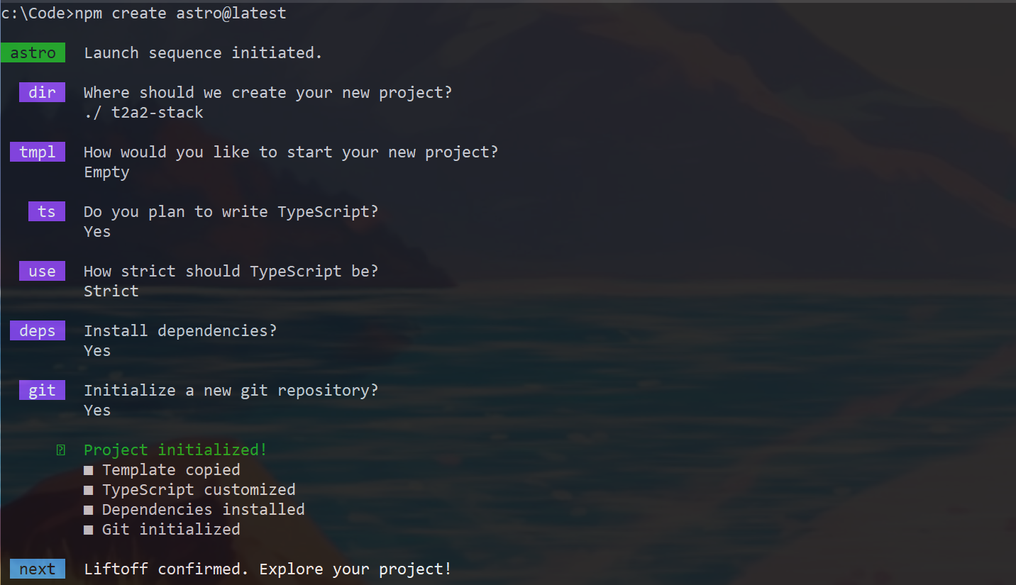
First, run this command to use Astro’s cli to bootstrap the astro project. Note that while the fastest way to get up and running with Astro is to use one of Astro’s templates, we’ll be starting with a blank slate for the purposes of focusing on the T2A2 stack.
# Using npm
npm create astro@latest
I selected an empty project, TypeScript, Strict, Install Dependencies, and Initialize a git repository.
This gives us a directory structure that looks like this
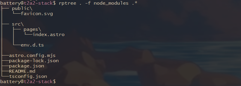 rptree is a nifty command line tool written in rust 🦀
index.astro has some html/astro boilerplate, and in the body element there’s a single
<h1>Astro</h1>And if we run the project like so:
npm run devwe see a blank, unstyled webpage with the “Astro” heading.
I’ll add a couple elements to the body so we have something to play with in the next steps
<!-- src/pages/index.astro -->
<!-- boilerplate above -->
<body>
<h1>T2A2</h1>
<div>
<div>
<p> 🔒 Typescript </p>
</div>
<div>
<p> 🚀 Astro </p>
</div>
<div>
<p> 🌀 Tailwind </p>
</div>
<div>
<p> 🗻 Alpine </p>
</div>
</div>
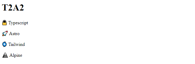
</body>which should look like this:
Good progress- however, this white background is hurting my eyes and we need to do something about that soon.

But before we do, we’ll quickly add an astro layout. Many html pages need to reuse code which isn’t very DRY.
I’ll create a new directory /src/layouts/ and in it create a new file BaseLayout.astro with the following contents.
---
const { pageTitle } = Astro.props;
---

<html lang="en">
	<head>
		<meta charset="utf-8" />
		<link rel="icon" type="image/svg+xml" href="/favicon.svg" />
		<meta name="viewport" content="width=device-width" />
		<meta name="generator" content={Astro.generator} />
		<title> {pageTitle} </title>
	</head>
    <body>
        <h1>T2A2</h1>
        <slot />
    </body>
</html>
A few things to notice:
- Inside the
code fence(the pair of three-s at the top of the page) we declare apageTitlevariable, and tell Astro that it will get the value from a child. - We use that
pageTitlevariable in thetitletag - Most importantly, we have a
slotin thebodyelement. When this layout is used, that’s where it will inject the additional content for a given page.
Now we can refactor index.astro to import and use this layout.
---
import BaseLayout from '../layouts/BaseLayout.astro';
const pageTitle = "Home";
---

<BaseLayout pageTitle={pageTitle}>
    <div>
        <div>
            <p> 🔒 Typescript</p>
        </div>
        <div>
            <p> 🚀 Astro</p>
        </div>
        <div>
            <p> 🌀 Tailwind</p>
        </div>
        <div>
            <p> 🗻 Alpine</p>
        </div>
    </div>
</BaseLayout>
Note that when we use BaseLayout we pass the pageTitle variable up to the layout component as a prop. Remember, it’s waiting for this value, as indicated by the Astro.props value we assigned it in BaseLayout.astro.
Step 2 - Integrate Tailwind Styling
The Astro docs have a full guide on integrating Tailwind if you want more detail, but it’s pretty straightforward. However, those docs kind of assume you already know how to use tailwind- I’ll assume you don’t, and include some basic information on how to actually start using it.
- Use the following command and say yes to everything (this bundles a few steps- if you want to do them manually, check the docs linked above)
npx astro add tailwind- Create a stylesheet in your
src/directory
This can be styles.css, base.css, whatever makes the most sense for your project. I’ll call this tailwind.css
Add the following lines to it
@tailwind base;
@tailwind components;
@tailwind utilities;
Later you can extend this as needed, but this is all you need to get started.
- Point your astro files to the tailwind styles
This part is a little unintuitive if you are used to vanilla CSS. We don’t point to the tailwind.css file we created in the previous step. Tailwind works by taking the tailwind you wrote and generating css output for you- that output is what you point to.
In /src/layouts/BaseLayout.astro add the following line in the head tag- you can call it whatever you want, I’ll call it output.css.
<link rel="stylesheet" href="/output.css">The leading / in the link tells astro to look for the file in the public/ directory- which currently just holds the favicon that was generated when you bootstrapped the astro project. Don’t worry, we’ll generate the stylesheet in the next step.
- Add a Tailwind command to the
scriptssection ofpackage.json
I’ll call this one tww for “tailwind watch”, since that’s usually how I like to run it.
"scripts" : {
    "tww":  "tailwindcss -c ./tailwind.config.mjs -i ./src/tailwind.css -o ./public/output.css --watch",
}
The filename you specify for the --output switch has to match the filename you pointed to in the previous step- in this case, output.css.
Add this file to your .gitignore
But before we run this command, let’s add some tailwind utility classes to our project so it has something to generate.
- Add Tailwind utility classes
In our BaseLayout.astro file, add the following utility classes to the body element and the h1 element
<body class="bg-slate-900 text-slate-100">
    <h1 class="text-center text-6xl">T2A2</h1>
    <slot />
</body>
This isn’t a dedicated Tailwind tutorial so I’m not going to dwell here, suffice it to say that after a bit of time spent using Tailwind utility classes, you’ll memorize the ones you use most frequently, and it doesn’t take long to get the hang of it. Instead of constantly defining arbitrary new classes and then needing to switch over to your css file and figure out what they do, you just tell your html what you want it to look like, and they become self-describing.
You can run this now to have Tailwind generate your css for you
npm run twwNote that if you included the --watch flag like I did, you’ll want to run this in another terminal (If you are constantly running astro, and the tailwind watch, something like tmux is your friend here, or you can split your terminal a few times in vscode with ctrl+shift+5)
I’ll add some additional Tailwind classes to the index.astro file next- to see it in full context check it out in the repo, but here’s what it looks like as I move on to the next step.
One last note on Tailwind before we move on- when you re-use the same group of utility classes many times, particularly if it’s a group of many classes, tailwind lets you combine the utility classes into a semantic class, like traditional css. Sometimes this is the play, but I’m not going to do it in this tutorial.
Step 3 - Integrate Alpine
Astro’s documentation on integrating Alpine can be found here.
You can use Alpine in a project without installing anything by including it in a script tag like so:
<!-- Put this in your head tag in the BaseLayout.astro, for example -->
<script defer src="https://cdn.jsdelivr.net/npm/alpinejs@3.x.x/dist/cdn.min.js"></script>
But Astro has a nifty integration for it that automatically includes alpine on every page for you, which I find preferable.
Simply run
npx astro add alpinejsThat’s it, now we can start using it!
The alpine docs have concise tutorials on building a counter, a dropdown, and a search input if you’re looking for ideas to get started with it.
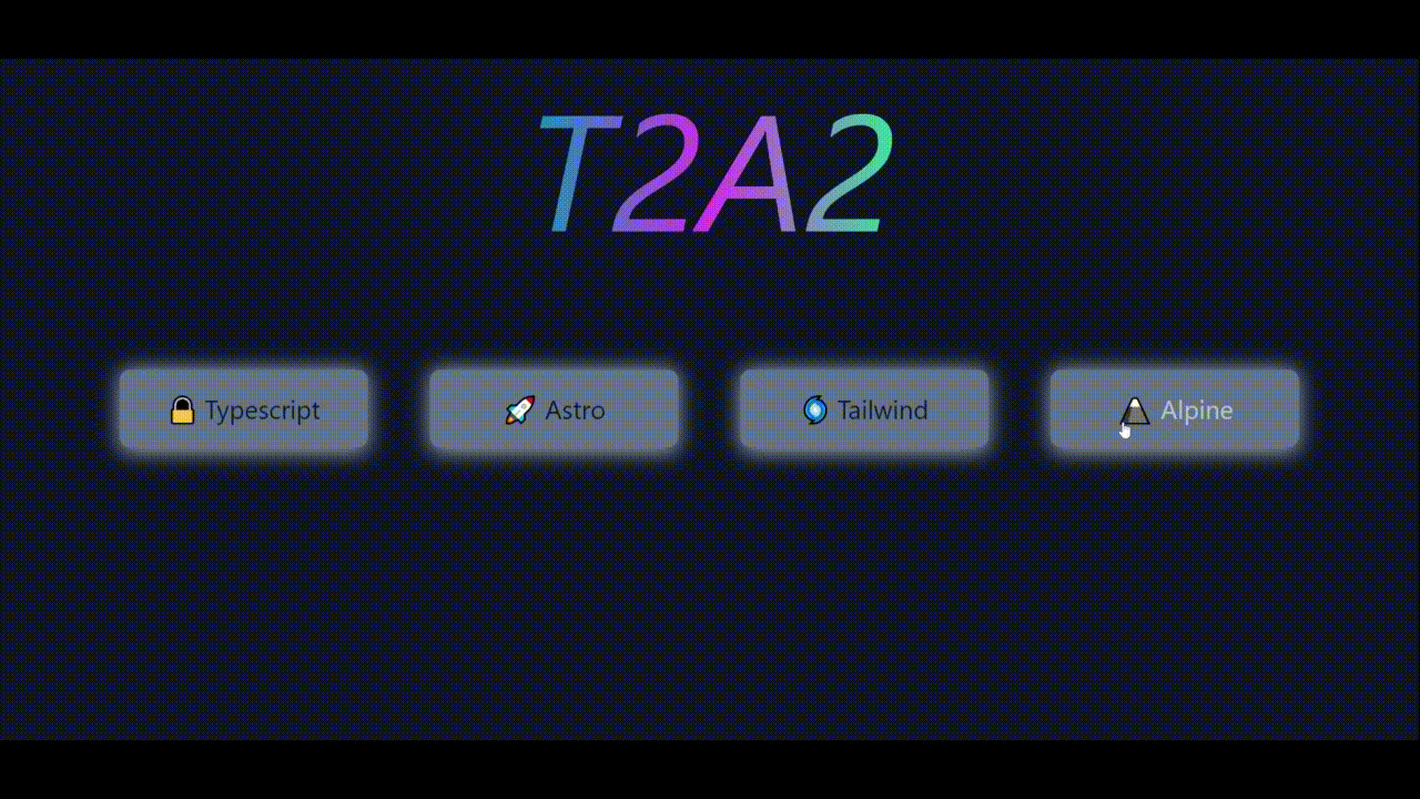
Let’s use Alpine to check if each of the cards have been toggled on, and if they are, to dynamically display an additional element.
We’ll refactor a bit to achieve this, and have a parent div that holds the data on the boolean state of each of the cards in a x-data directive.
<div x-data="{ cards: [false, false, false, false], get allToggled() { return this.cards.every(c => c); } }"
	class="mx-auto flex flex-col justify-center items-center text-center mt-24"
>
and for each card, we’ll then add some conditional classes using the :class syntax, and toggle the state of each card using the @click directive
<div
    class="relative rounded-lg w-full p-4 cursor-pointer z-10"
    :class="{'bg-emerald-400': cards[0], 'bg-slate-500': !cards[0]}"
    @click="cards[0] = !cards[0]"
>
Repeat this logic, adjusting the index for each card.
Finally, we’ll add an element at the end of the component that only displays if all the cards are toggled to true
Alpine gives you some default transitions and animations you can use out of the box, or you can use x-transition:{state} to get more granular control like this:
<div
x-cloak
x-show="allToggled"
class="mt-12 text-3xl text-emerald-500"
x-transition:enter="transition ease-out duration-200"
x-transition:enter-start="transform -translate-y-full opacity-0"
x-transition:enter-end="transform translate-y-0 opacity-100"
x-transition:leave="transition ease-in duration-200"
x-transition:leave-start="transform translate-y-0 opacity-100"
x-transition:leave-end="transform -translate-y-full opacity-0"
>
✨✨✨ Hooray! All elements are toggled! ✨✨✨
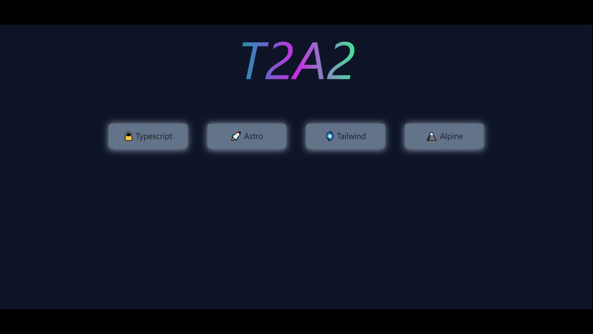
</div>Which give us this as the final result
Wrapping up
So where does that leave us? Here is the state index.astro with everything included.
---
import BaseLayout from '../layouts/BaseLayout.astro';
const pageTitle = "Home";
---
<BaseLayout pageTitle={pageTitle}>


<div x-data="{ cards: [false, false, false, false], get allToggled() { return this.cards.every(c => c); } }"
	class="mx-auto flex flex-col justify-center items-center text-center mt-24">
	<div class="flex justify-center items-center gap-12">

		<div class="relative w-48">
			<div
                :class="{'bg-emerald-300': cards[0], 'bg-slate-400': !cards[0]}"
                class="absolute top-0 rounded-lg w-full h-16 blur z-0"
            ></div>
			<div
                class="relative rounded-lg w-full p-4 cursor-pointer z-10"
                :class="{'bg-emerald-400': cards[0], 'bg-slate-500': !cards[0]}"
                @click="cards[0] = !cards[0]"
            >
				<p class="text-xl hover:text-slate-200 transition-all duration-300">
					🔒 Typescript
				</p>
			</div>
		</div>

		<div class="relative w-48">
			<div
                :class="{'bg-emerald-300': cards[1], 'bg-slate-400': !cards[1]}"
                class="absolute top-0 rounded-lg w-full h-16 blur z-0"
            ></div>
			<div
                class="relative rounded-lg w-full p-4 cursor-pointer z-10"
                :class="{'bg-emerald-400': cards[1], 'bg-slate-500': !cards[1]}"
                @click="cards[1] = !cards[1]"
            >
				<p class="text-xl hover:text-slate-200 transition-all duration-300">
					🚀 Astro
				</p>
			</div>
		</div>

		<div class="relative w-48">
			<div
                :class="{'bg-emerald-300': cards[2], 'bg-slate-400': !cards[2]}"
                class="absolute top-0 rounded-lg w-full h-16 blur z-0"
            ></div>
			<div
                class="relative rounded-lg w-full p-4 cursor-pointer z-10"
                :class="{'bg-emerald-400': cards[2], 'bg-slate-500': !cards[2]}"
                @click="cards[2] = !cards[2]"
            >
				<p class="text-xl hover:text-slate-200 transition-all duration-300">
					🌀 Tailwind
				</p>
			</div>
		</div>

		<div class="relative w-48">
			<div
                :class="{'bg-emerald-300': cards[3], 'bg-slate-400': !cards[3]}"
                class="absolute top-0 rounded-lg w-full h-16 blur z-0"
            ></div>
			<div
                class="relative rounded-lg w-full p-4 cursor-pointer z-10"
                :class="{'bg-emerald-400': cards[3], 'bg-slate-500': !cards[3]}"
                @click="cards[3] = !cards[3]"
            >
				<p class="text-xl hover:text-slate-200 transition-all duration-300">
					🗻 Alpine
				</p>
			</div>
		</div>

	</div>
	<div
		x-cloak
		x-show="allToggled"
		class="mt-12 text-3xl text-emerald-500"
		x-transition:enter="transition ease-out duration-200"
		x-transition:enter-start="transform -translate-y-full opacity-0"
		x-transition:enter-end="transform translate-y-0 opacity-100"
		x-transition:leave="transition ease-in duration-200"
		x-transition:leave-start="transform translate-y-0 opacity-100"
		x-transition:leave-end="transform -translate-y-full opacity-0"
		>
		✨✨✨ Hooray! All elements are toggled! ✨✨✨
	</div>
</div>

</BaseLayout>
When using tailwind + alpine together, I tend to break up the tailwind classes and alpine declarations for readability, but even if you combine it all, it’s a relatively long file for the amount of html elements on the page!
However, we didn’t touch a css file, and we also didn’t have to write a single line of JavaScript. This Astro component tells us everything that’s going on.
I find that this stack strikes a balance between simplicity and power, structure and flexibility. Let me know what you think!
I find that this stack strikes a balance between simplicity and power, structure and flexibility in situations where other frameworks might be overkill. Let me know what you think!