
Nuxt Basics
Introduction
I’d like to do a short series of posts on how to get up and running with Vue/Nuxt.JS.
This is the simple landing page we’re going to build:
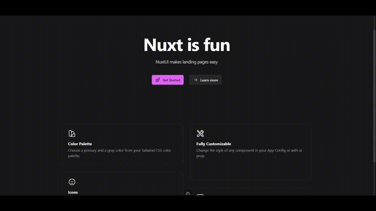
All of the code for this example can be found in this GitHub repository.
Getting Started
Prerequisites:
Node.js v18.0.0+
- Create a new nuxt project
Run the following command with the name of your project, and answer
npx nuxi@latest init <project-name>cd into your project, and run npm install
- Add nuxt ui components
npm i @nuxt/uiThen, in your nuxt.config.ts file, add the @nuxt/ui module like so:
export default defineNuxtConfig({
  modules: ['@nuxt/ui']
})
This automatically installs the nuxtjs/tailwindcss module for you. Test this by modifying your app.vue file. Delete the NuxtWelcome element and replace it with a h1 element, and give it a tailwind utility class like so:
<template>
  <div>
    <h1 class=" text-blue-500 ">Hello World!</h1>
  </div>
</template>- Basic theming with Nuxt UI
Create an app.config.ts file at the root level, and give it the following contents:
export default defineAppConfig({
    ui: {
      primary: 'fuchsia',
      gray: 'cool'
    }
  })
Now, go back and modify the app.vue file to use the primary variable. Let’s also make the text large and centered.
<template>
  <div>
    <h1 class=" text-6xl text-primary grid place-content-center h-screen ">Welcome to the homepage</h1>
  </div>
</template>
Great! The <h1> element should now be larger, and also reflect the tailwind color you set for the ui.primary field.
- Add a NuxtUI component
Add this line to your nuxt.config.ts file so you can use the pro components- it’s free to develop with, although you need to buy a license if you want to deploy a project that uses a pro component.
extends: ['@nuxt/ui-pro'],You don’t need to change anything else.
Now, let’s go ahead and use some components- you can find a full list of them in the NuxtUI documentation- note you need to change the selection in the sidebar depending on whether you want to view the regular or pro components.
I’ll go ahead and grab the examples for the ULandingHero component, and the ULandingGrid component, and put them inside a new file, pages/index.vue
// index.vue
<template>
  <div class=" grid justify-items-center" >

    <ULandingHero
    title="Nuxt is fun"
    description="NuxtUI makes landing pages easy"
    :links="[{ label: 'Get Started', icon: 'i-heroicons-rocket-launch', size: 'lg' }, { label: 'Learn more', icon: 'i-heroicons-arrow-small-right', color: 'gray', size: 'lg' }]"
    />

    <div class="w-2/3 ">
      <ULandingGrid>
        <ULandingCard class="col-span-6 row-span-2" icon="i-heroicons-swatch" title="Color Palette" description="Choose a primary and a gray color from your Tailwind CSS color palette." />
        <ULandingCard class="col-span-6 row-span-4" icon="i-heroicons-wrench-screwdriver" title="Fully Customizable" description="Change the style of any component in your App Config or with ui prop." />
        <ULandingCard class="col-span-6 row-span-4" icon="i-heroicons-face-smile" title="Icons" description="Choose any of the 100k+ icons from the most popular icon libraries." />
        <ULandingCard class="col-span-6 row-span-2" icon="i-heroicons-computer-desktop" title="Keyboard Shortcuts" description="Nuxt UI comes with a set of Vue composables to easily handle shortcuts." />
      </ULandingGrid>
    </div>

    <div class=" h-12 "></div>

  </div>
</template>
Then in app.vue, use the <NuxtPage /> element to magically reference the that index.vue page at /.
// app.vue

<template>
  <UMain>
    <NuxtLayout>
      <NuxtPage />
    </NuxtLayout>
  </UMain>
</template>
Wrapping up
That’s it! Not only is it easy to put together, but all of your NuxtUI components will match your theme with 0 additional effort.
In a follow-up post, I plan to show how to take this basic starting point and turn it into a full stack web application.